I'm a mama of three doing what I love and fueled by Grace, Mercy, and a whole lot of coffee. I'm so glad you are here!
Hey, friend!
I'm Courtney.
mini brand
brand building
website design
template customization
tell me more
Browse by
category
Move to Manual: Composition & Perspective
I have been completely overwhelmed by everyone’s response to this series! I had no clue when I started pondering the idea that it would be so well received. So many of you have emailed, Facebooked and tweeted me your appreciation (which is quite flattering considering the series hasn’t even officially begun).
I wanted to make an exciting announcement before I begin!
My very best friend, mentor and fellow photographer Amy from Simply b Photos will be partnering with me during this series! She’s offering to share her skill, technique and knowledge on all things photography during this series and I couldn’t be more excited to have her. She’s just getting back from an extended vacation (remember me mentioning how jealous I was of a friend who just jetted off to California? Yeah..) so she’ll be sharing next week on Exposure and Lighting as well as in the coming weeks as we get more in depth with how to work your cameras. I was already shooting in Manual when I met Amy, but her photography is breathtaking and I’ve learned more from watching her work, sharing hundreds of conversations sitting across from each other on the couch and participating in her Professional Workshop than I could ever have learned anywhere else. You guys will want to hear what she has to say and take to heart her lessons. She’s a fantastic teacher and the passion she has for photography is contagious.
All that being said…let’s jump into the series!
I spent a lot of time debating where to begin. I thought of diving right in and discussing aperture, shutter speed, and ISO. But, then I remembered what I struggled with the most (though I didn’t realize it at the time) when I was getting started:
Composition & Perspective
It makes little difference how well you know your camera and how technically sound you are in your abilities as a photographer if you don’t know how to capture an image worth looking at. I am going to assume that most everyone that will be reading this series is interested in learning to take better portraits, so Amy & I will be approaching this series from that perspective (shooting people and children). Truly great portraiture is about capturing a moment too precious to interrupt.
As mothers, we are all too often tempted to grab our cameras and ask our children to say “Cheese!” or to “Smile for the Camera!” I remember growing up going to sit in front of the camera for school pictures and the “photographer” behind the lens yelling “Say Cheese!” to every child that sat on the stool. Even now, whenever I hear that, those are the kinds of photos that I think of. Those posed, forced smile photos that stir no emotion and bring back no feelings or memories. Just a child in their best clothes sitting on a stool in a cafeteria.
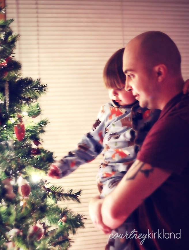
As Little Man has gotten older and really started to explore the world around him (and by “explore” I mean demolish, trample and make messes), I’ve been able to capture some exciting and memorable moments. All without walking around with the camera in my hand and hollering “Cheese!” One of my favorites is this one of the husband and Little Man at Christmas, taken by our Christmas Tree. This past season was the first year that Little Man has really been old enough to get into the spirit of the holidays. The presents, the ornaments, the lights…it was all brand new to him. The evening we put the tree up he was just mesmerized.
This photo represents every single emotion I watched Little Man experience during the holidays: excitement, wonder, mesmerization. Had I told the two of them to look at me and smile, I would have taken away from that moment. I would have popped the bubble of emotion and excitement that was being experienced and this photo would have been like a thousand other snapshots that I’d taken: devoid of meaning or emotion.
Have you been taking images that are nothing more than snapshots taken with a fancy camera? Are you interrupting the moments you’ve been attempting to capture by trying to force a smile or a reaction? What can you do different from a photographic perspective to change that?
It’s All in the Details
I think Amy said it best in her workbook: Who We are is in the details: the way we curl our hair, the jewelry we wear, the perfume we love…
Attention to the details in my photography is something that I am striving to do more of. I have a strong passion and love for lifestyle portraiture and one of the key aspects of that is attention to detail.
And, as a mother of a boy who is growing way too fast, the details of who he is are becoming more and more important to me.
Little Man was born with these beautiful, long eyelashes. I’m not exactly sure where he got them (I think from my dad, who has always had long eyelashes…but managed to skip passing that gene on to his daughters), but everyone has always complimented him on how long and beautiful they were. One day, while taking some snapshots of Little Man in the floor of our living room, I saw the opportunity to snag a shot at an angle that would enhance them.
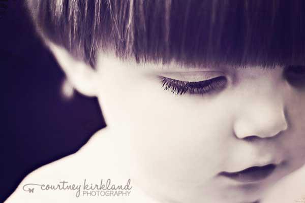
Similarly, Little Man was born with a head full of dark hair. Everyone at the hospital was amazed by how thick his hair was as a newborn. Over time it has lightened up, but its thickness remains (that trait, he definitely gets from me). But, despite his long, thick hair, this child hates to have a haircut. Which is why when you see him, it’s most likely brushing the collar of his shirt and hanging in his eyes. I have dozens of photos of his cute little face all covered up by his long bangs. Not too long ago, he realized that he could blow his hair out of his face. He thought it was the funniest thing ever and spent hours running around telling me to “Wook! Wook! I blow my hair!”
What details in your own life have you been overlooking that you could capture? A favorite toy your child carries? A birth mark?
The Rule of Thirds
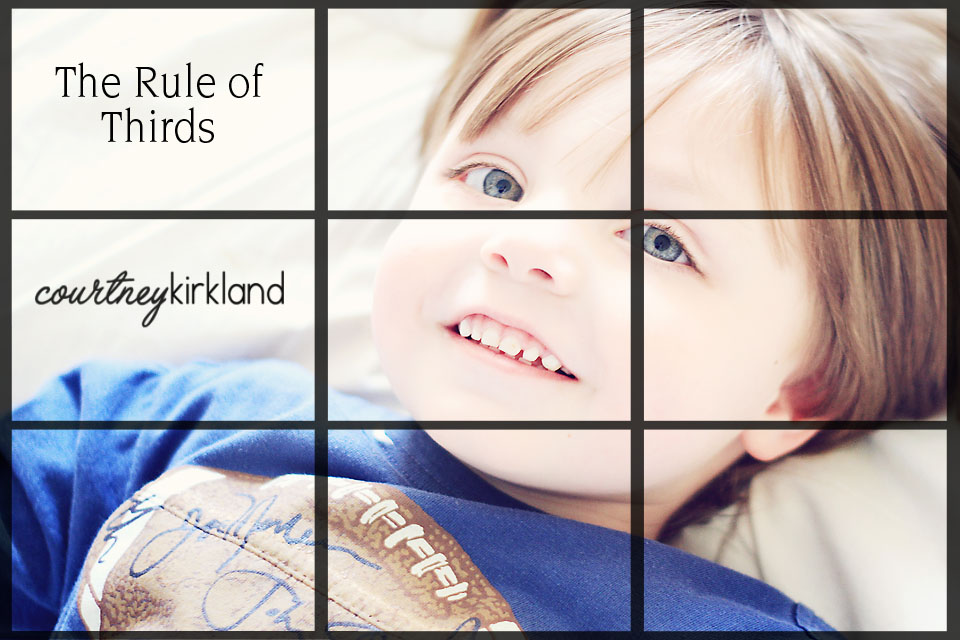
This is the only photography “rule” that you will hear me refer to and actually rely on. According to Wikipedia the Rule of Thirds says:
…that an image should be imagined as divided into nine equal parts by two equally-spaced horizontal lines and two equally-spaced vertical lines, and that important compositional elements should be placed along these lines or their intersections.
That says that there is an area in a photo that your eye is naturally trained to visit first…and it’s not the dead center. By centering your images, you leave nothing for your eye to explore. It’s dull, uneventful, and leaves nothing to be desired when glancing over it. By not centering your images, you’re giving viewers a chance to linger a bit longer over the photo. You’re creating an atmosphere that is more pleasing and more emotional.
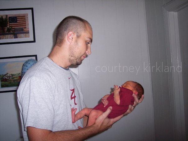
When I first started shooting I was under the impressions that every shot needed to be in the dead center. I would chase my toddling son around (saying, “Noah! Look at mommy! Over here, Noah!” which, as I hope you learned already is also a no-no) trying to get him to sit still long enough to center him. Take a look at this early photo of the husband and Little Man:
Now, while there are about a million and one things wrong with this photo (on camera flash and nasty shadows?! Eeep!), one of the biggest issues is that it’s completely centered. All you see when you look at this photo (besides those terribly tacky pictures in the background) is the subject. You see this photo and immediately move on because there’s nothing else for your eye to explore. Whereas, in the photo above of Little Man, you linger a bit longer. Explore the image before moving on. That’s what you want your photos to do…cause someone to pause and really take in what it is you are trying to capture.
So…Did you learn anything?
I promised in the introduction of this series that I was going to generate some “homework” assignments to get you guys going and testing out some of the things that I talk about here. If you haven’t already, head over to join the Move to Manual Flickr Pool so that you can share your images with everyone else! I started out the “assignments” by asking each of you to upload a photo as a jumping off point reference. I’d love to see how far you all come in the next few weeks as we progress through using your camera and understanding the manual function.
Now, for this weeks assignment, I’m challenging you take three different photos:
- Photo One: Capture a photo that tells a story or showcases an emotion. Follow your child around for a bit and snap photos of them playing. Don’t interrupt their playtime or intercede in the little moments…just shoot. And see what you come up with.
- Photo Two: Pay attention to the details. Like Amy said, we all have details. We all have minuscule little nuances that make up who we are. Seek those out in your day-to-day life or in your children, then capture it in a photo.
- Photo Three: Purposely avoid shooting a photo straight on and centered. Step to the side and change up your angle a bit before shooting. Rearrange yourself before shooting and see what a difference using the rule of thirds can make!
Go grab your cameras and start shooting! Be sure to upload your assignment photos to Flickr so Amy & I can come leave you guys feedback! I’m planning to only post these tutorials on Monday’s, but there were a few more aspects of Composition that I wanted to cover before jumping into Lighting and Exposure, so be sure to come back for those on Wednesday before Amy shares her knowledge on Monday!
Leave a Reply Cancel reply
Truly easy-to-customize websites for those who need a polished look with a quick turnaround.
Learn More ↦
Shop premade designs
Draw in potential customers with a seamless web experience and SEO optimized site pages.
Learn More ↦
website design
Discover your creative voice with a unique logo development & coordinating brand collateral.
Learn More ↦
brand building
A seamless single logo brand identity experience for those with a clear vision.
Learn More ↦


Hi Courtney,
I just found your website and couldn’t stop reading about your M2M series. I joined your Flickr group and posted my first picture as a reference point. I’m not sure I’d the series is done or still ongoing but wanted to join and start learning how to shoot in manual and take better pictures. Thanks! Shannon
I just found this and I am so excited to read more! Thank you so much for setting this up and doing all of the work! love love love this!
[…] covering all of the basic aspects of photography and how to use your camera. We’ve gone over the basics of composition and lighting; what aperture is; how shutter speed, iso and white balance can change your photos, […]
[…] already talked about using the rule of thirds and overcoming the desire to shoot with your subject in the center of the photograph all the time. […]
[…] missed any of the Move to Manual posts so far be sure to check them out! We’ve talked about Composition & Perspective, Finding Great Light, Understanding Aperture and Understanding Shutter Speed. All of these […]
Thanks so much for doing this , I know im a bit late on starting as I just came across your wonderful site. I will get onto taking some sanps of my children tomorrow
[…] you missed the first two installments of the Move to Manual Series, so far we’ve talked about composition and perspective in your photographs and how to find great light. Make sure you check these two posts […]
thank you. this is very inspiring and it’s not as difficult as reading my camera manual.